Carillon
A tablet-first Flutter finance dashboard kit for student money — tuition, grants, stipends, and term budgets — whose board fills the viewport and never scrolls.
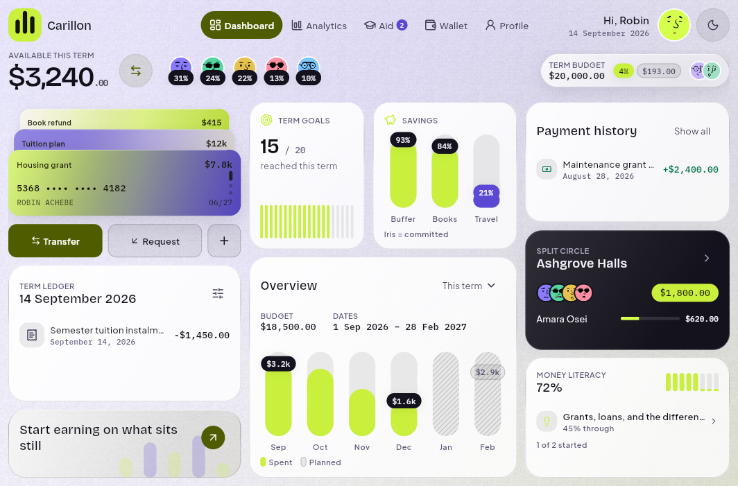
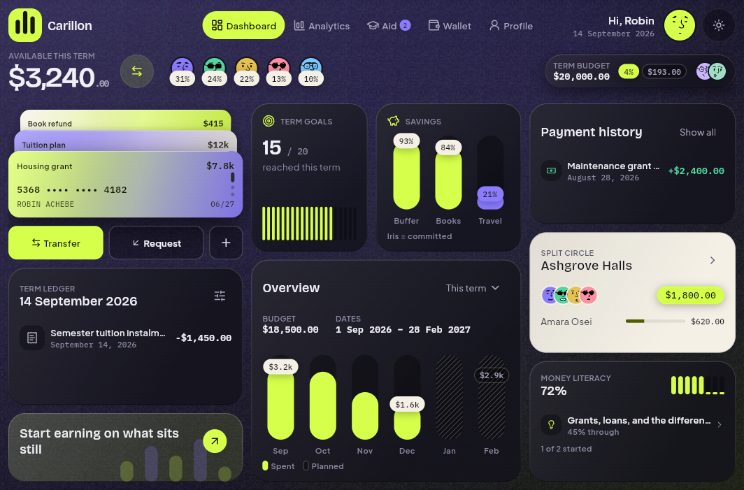
Carillon is a tablet-first Flutter UI kit for student money — tuition, grants, stipends, term budgets, and shared housing costs. The main screen is a board that fills the viewport and never scrolls. No admin sidebar. No data grid. A single dense bento designed for the screen a nineteen-year-old opens to know whether they can afford next month.
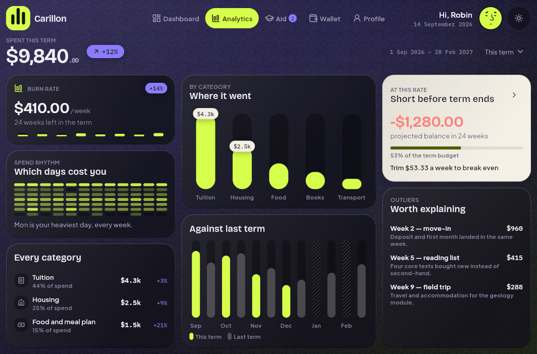
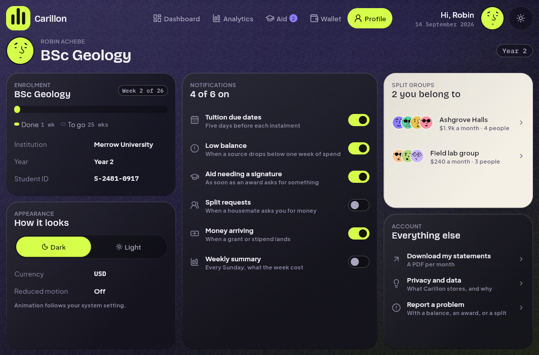
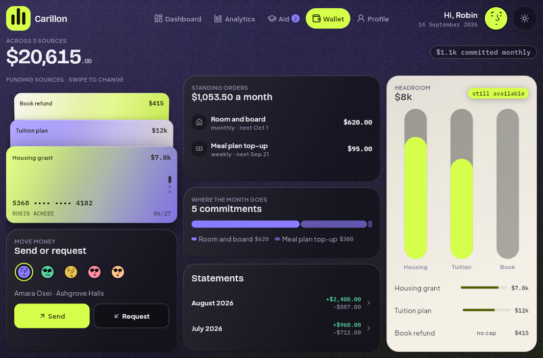
The category's common failure is a beautiful overview and four dead links. Carillon ships five complete, wired-together destinations — Dashboard, Analytics, Aid, Wallet, and Profile, every one built to the same contract, not just the hero screen — sitting behind a real sign-in flow, not a stub.
The chime language
Carillon's signature element is a run of tuned vertical tubes — capsule tracks with capsule fills rising inside them, named for the bell tower on a university campus. What started as one primitive is now a small language of three forms, because a column of tubes can only answer one question. `ChimeColumn` compares magnitude — spend by month, funding by source. `ChimeFlow` lays a tube on its side and divides it into shares, for "what is this made of" — the composition question separate bars structurally cannot answer. `ChimeGrid` turns the tubes end-on into a small grid, for "when, and how regularly" — the shape an average hides. The savings tile, the term chart, the funding mix, the monthly commitments, the spend-rhythm heatmap, the loading skeleton, and the brand mark are all the same visual family at different sizes and orientations.
Sign-in, with a floor under it
A complete `features/auth`: an `AuthRepository` interface, a mock implementation with real failure outcomes — a locked account, a wrong password, a provider that refuses — and client-side validation, because a kit whose auth always succeeds ships an error state nobody has ever seen. Provider buttons carry lettermarks, not brand logos; the marks are trademarks and aren't redistributable inside a kit sold to a third party. Deep links survive the trip through sign-in — the attempted destination rides along in a query parameter and gets restored afterward. And `AuthPhase` has three states, not two, so "we don't know yet" is never collapsed into "signed out," which is what makes an app flash its sign-in screen for a frame on every cold start.
What's on the board
- Full-width stat band with live balance, grant total, and term spend.
- Ten cards: funding deck, action triad, term ledger, goal tile, savings tile, earn prompt, term overview, payment history, split circle (the one inverse card), and literacy guides.
- Three columns at 1024+, two at 768, one scrolling column below — the board never scrolls above the breakpoint, and the breakpoint reads height as well as width.
- All three states, on every screen: a skeleton that mirrors the composition card-for-card, a designed empty state, and an error surface that says what happened — governed by one `LoadingPolicy`, so nothing flashes a skeleton under 120ms or redraws one over a screen the reader is already looking at during a refetch.
Design
Obsidian-iris and citron — no gold, no brown, no Material defaults. Cards no longer cast a shadow; a translucent card with a blur pooled under it says the card is paper hovering above the page, and glass doesn't hover. Depth is now a painted rim — lit along the top, shaded along the bottom — and each card samples the page's own gradient at its position and tints itself with the answer, so a card in the iris corner reads iris and one in the citron corner reads citron, continuously, without anyone assigning a colour per card. Type is Bricolage Grotesque for headings, Plus Jakarta Sans for body, IBM Plex Mono for data — all under SIL OFL 1.1, no licence to chase.
Architecture
- Riverpod 3 with riverpod_annotation code generation — one provider per question, no god object.
- go_router with typed, deep-linkable routes and an auth-aware redirect guard.
- Freezed domain models — immutable, type-safe, no raw JSON maps drifting through the widget tree.
- No backend by design, but the seam is documented, not just declared: `docs/data/` has the schema, an ERD, the REST contract, a field-to-widget map, a runnable PostgreSQL migration with row-level security, and the four steps from mock to live. The bundled fixtures are the exact payloads the docs describe — a server that matches the contract needs no other change.
- All painted assets — no stock images, no font licences beyond OFL. Every colour traces to `AppTokens`, a `ThemeExtension` that is the single source for the whole kit.
The quality bar
Zero analyzer issues. 118 tests: a screen × breakpoint × theme matrix, an auth guard suite covering every failure mode the mock repository can produce, chrome and board geometry assertions, primitive widget tests, formatter unit tests, and golden baselines across every screen — sign-in included. Responsiveness and the auth flow are both verified by the suite, not by eye.
Built for
Flutter developers and small teams building a student-finance or campus-life app who can already write a ListView — and who don't want to spend three weeks on the bento layout, the chart language, a real sign-in flow, and a token system that holds together in both themes.
Stack
Screenshots